Recently I came across the work of Interior designer Jessy van Gorp. Most of the homes she created are both functional and timeless at the same time. Her concepts are characterized by simplicity, craftsmanship and fine detailing. Carefully selected colors and textures are setting the tone for understated luxury and beautiful balanced homes.
This residence in Antwerp, a single family home, is situated on a large sun-oriented domain in a green environment.”Every window of the house looks out onto trees or lawns. As every project and client are unique, so is their living environment. The wishes of the client are linked to the possibilities of the space and the incidence of light. And we knit all this together into a harmonious whole” says Jessy when I asked her to tell me some more about Residence Z.

Coming home and relaxing after a hectic day
Here, the briefing was was light and airy, soft and subtle. Peace, warmth and a calm feeling were also important. Silence. Coming home and relaxing after a hectic day.
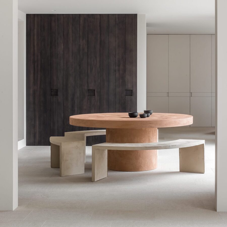
The adjacent spaces connect seamlessly, but each has its own atmosphere: from the off-white kitchen to the ‘pinkish terracotta’ table in the dining room to the beige and black/brown seating area, with open access to the TV corner in the bend. The residents are always connected with each other, but still enjoy the necessary intimacy. With a connection of open spaces, we also create interesting perspectives and easy circulation.
The natural (sun)light has ample opportunity to do its work due to the large glass sections and can thus accentuate the pronounced lines and volumes in the interior. The large, as it were, ‘framed’ sliding door from the dining room to the home office provides privacy or a beautiful view of the green surroundings. The master bathroom houses a sauna and massage shower behind the step. The incident light plays on all the clean lines here, making the step visible. Simplicity keeps coming back in my work.


Natural materials
Many natural materials have been used: natural stone with a grainy texture on the ground floor or marble with a pronounced pattern in the bathrooms, all laid in a wild pattern. The choice of wood is sometimes light, sometimes dark tinted and heavily brushed oak. We use natural lime plasters in the wet areas and linen, wool and cotton for the textiles. Natural materials remain my favorite. Nature provides the most spectacular textures and colors. The color palette used here is subdued and calm. It feels warm and pleasant. Many shades of white and beige against a contrasting dark brown, and the ‘pinkish terracotta’ as an eye-catcher.
Numerous conversations with the client form the basis. It is always nice if you can work synchronously with the client and end up on the same wavelength.
That is why it is necessary to invest time to get to know the client, to feel and above all to listen… what are their needs, how do they want to live, what are they interested in? To finally end up with a house in which the family feels at home, can relax and is glad to invite family. In short, a place where the client feels happy.


Thank you so much Jessy for the beautiful images and explanation about your work.
Interior design Jessy van Gorp – Photography by Cafeine