When an invitation to join a Monochrome masterclass by Paint & Paper Library hits your mailbox I am curious to find out more! At the event space, the beautiful location of Enter the loft, huge pictures on painter’s easels showed different interiors all in Monochrome colours Ruth Mottershead and her colleague Vincent with his charming French accent, explained the different paired combinations and how to combine them in an interior.
Each white tone has been carefully selected for its versatility: all six whites can be used as striking, independent, all-over shades, but appear equally effectively as beautiful, plain whites within a scheme of tonal similarity.
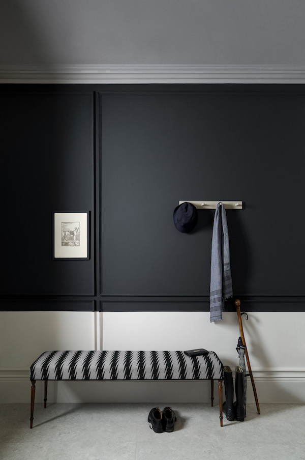
Each black tone has been judiciously designed to be used with its monochromatic partner, in lesser or greater proportion, to dramatically change the interplay of light and space in a room, while at the same time effortlessly coordinating with existing materials and surfaces in the interior scheme.
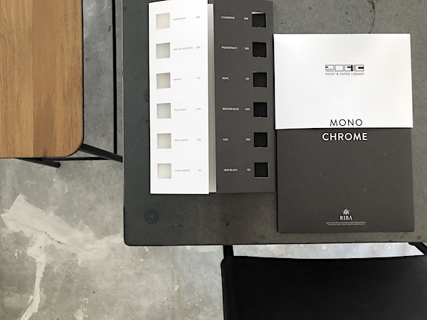
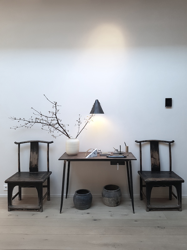
Each white and black pair adopts the hue of the Paint & Paper Library ‘Original’ colour shown alongside it, thus presenting six options of varying undertone, including ochre, pink, warm grey, cool grey, blue and green. A few examples…
Clean White & New Black: These ‘Original Colours’ are currently extremities on Paint & Paper Library’s renowned colour card. The palest white and darkest black, each can be used to bring more depth to a classic, cool grey interior.
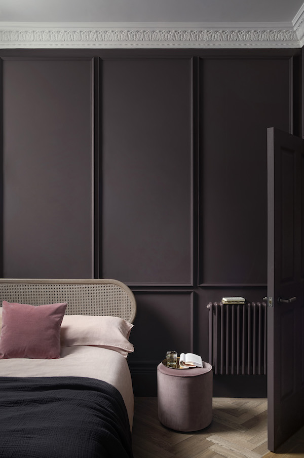
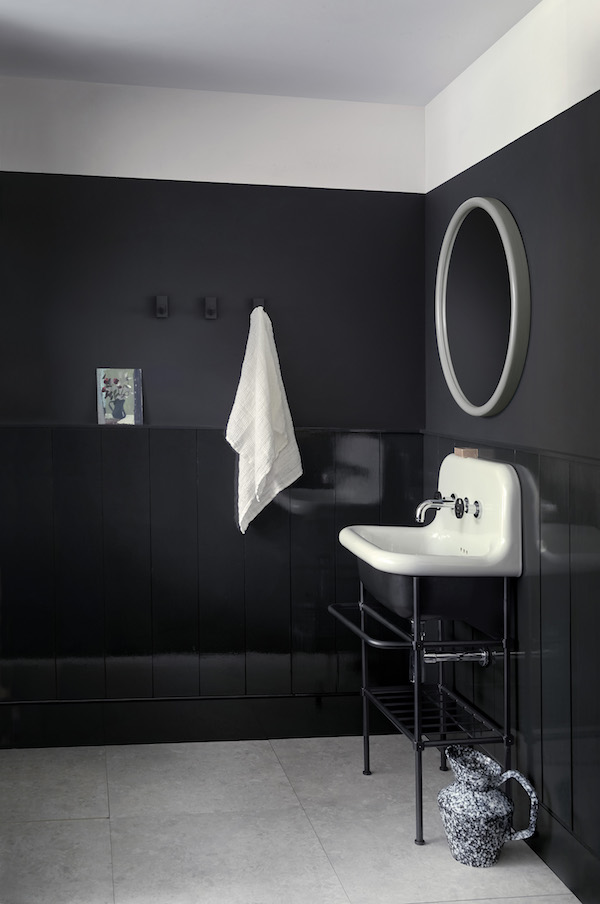
Eau de violette & Pontefract – With a visibly pink undertone, this elegant combination brings perceptible warmth without the use of any yellow pigment. It is particularly smart against darker hardwoods and pinkish stone or marble.
Minim & Kolh pictured below – A beautiful white in its own right, Minim is clean without being too bright, and is very stable in north and south facing rooms. Kohl is a charismatic neutral black with a suggestion of warm charcoal. The new collection will be available from September 2019